Text is the hardest thing to embroider well. A logo shape can hide a lot of small errors, but a name, a job title or a slogan can't — get the digitising wrong and it's instantly obvious. These are the six lettering problems that come up again and again on cheap or rushed embroidery, and exactly why none of them happen here.
1. Collapsed Letters
Small letters — e, a, p in particular — need their density and underlay set specifically for that size. Get it wrong and the machine over-stitches until the letter just fills in and "gets eaten," leaving a solid blob where a word should be.
2. Slanted & Sinking Letters
Poor thread tension, or a stabiliser that isn't matched to a stretchy garment, lets the fabric move slightly under each letter as it stitches. The result is text that visibly slants or sinks along the line instead of sitting level.
3. Thread Popping Out
This comes down to pull compensation — the digitiser has to widen each stitch path slightly to allow for the fabric pulling inward as it's sewn. Skip that step and thread ends escape past the edge of the letter instead of staying tucked inside it.
4. Uneven Stitch Angles
Good satin-stitch lettering has stitches running at a consistent angle across each letter. When a design hasn't been properly digitised for the shape, the stitch angles wander, and the letter reads as rough or "broken" even though every stitch is technically there.
5. Closed Counters
The little enclosed hole inside letters like e, a and o is called the counter, and it has to stay open for the letter to read correctly. With standard thread, any opening smaller than about 1mm is at real risk of stitching itself shut — which is exactly why small text needs its own digitising, not a shrunk-down version of a big logo.
6. Fabric Tunneling
When the stabiliser backing is too weak for the stitch density going into it, the fabric gets pulled in around the lettering instead of staying flat — you can see and feel it "tunnel" inward around the design, and it never fully relaxes back out.
Why This Doesn't Happen On Our Machines
Every one of these six problems comes from the same root cause as the defects in our last post: a design that's been digitised against a generic template rather than the actual letters, at the actual size, on the actual garment. Small text especially can't just be shrunk down from a big logo file — density, pull compensation, counter size and stitch angle all have to be set specifically for it.
We digitise every logo and every line of text ourselves, in-house, checking exactly this: that small letters stay open, that pull compensation is set so nothing pops loose, that stitch angles are consistent, and that the stabiliser matches the fabric so nothing tunnels. It's why we can put your business name or a slogan on a garment and have it still read clearly, not just look right in the mock-up.
Small Lettering On Real Jobs
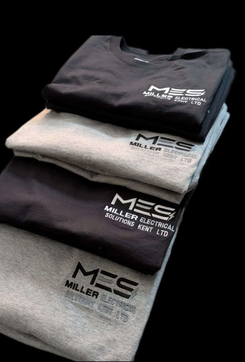
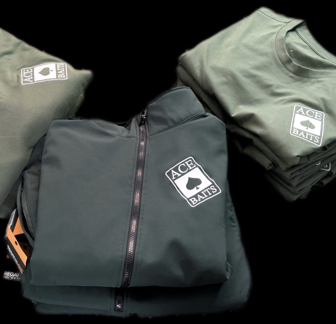
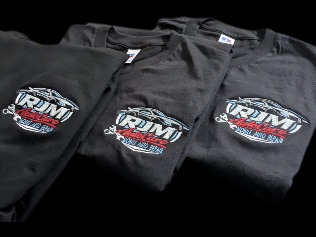
No diagrams for this part — these are real jobs. Small multi-sponsor text, fine script lettering, tight block capitals: counters stay open and nothing collapses, however small it gets.

Further reading: Push and Pull Compensation in Embroidery Digitizing.